. 2020 Jul 30;9:e56518. doi: 10.7554/eLife.56518

Figure 2. Comparing MD simulations with experiments.

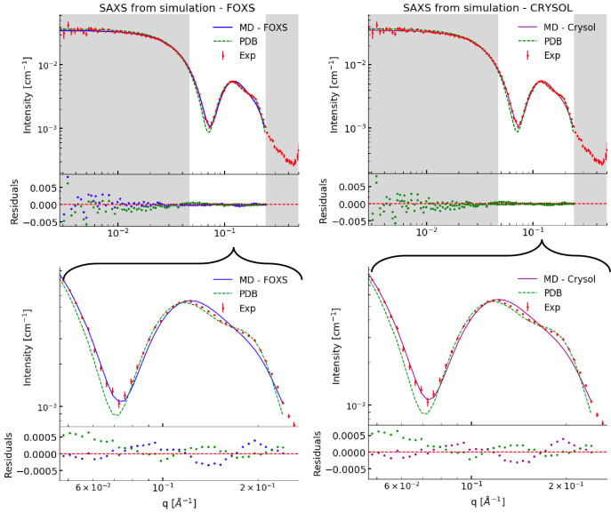
(A) Visualization of the conformational ensemble from the MD simulation by clustering (blue). Only the protein parts of the nanodisc are visualized while the lipids are left out to emphasize the shape. The top three clusters contain 95% of all frames. The previous NMR/EPR-structure is shown for comparison (red). (B) Comparison of experimental standard solution SAXS data (red) and SAXS calculated from the simulation (blue). Green dotted line is the back-calculated SAXS from the integrative NMR/EPR-structure (labelled PDB). Residuals for the calculated SAXS curves are shown below. Only the high q-range is shown as the discrepancy between simulation and experiments are mainly located here (for the entire q-range see Figure 2—figure supplement 1). (C) Comparison of average distances from simulations (blue) to upper-bound distance measurements (red) between methyl NOEs. The labels show the residues which the atoms of the NOEs belong to.

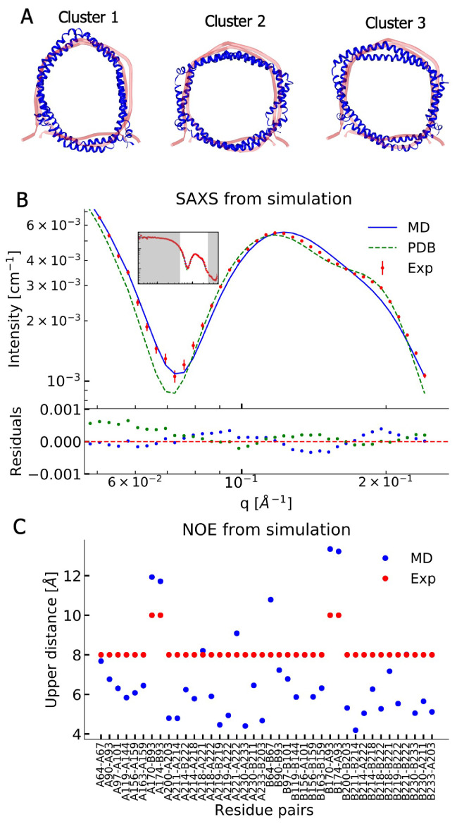
Figure 2.

Figure 2—figure supplement 1. Comparing simulations with SAXS data.

Figure 2—figure supplement 1.

This figure is an expanded version of that in the main text, which shows only part of the q-range (marked in white).
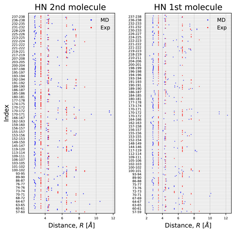
Figure 2—figure supplement 2. HN-NOE.

Figure 2—figure supplement 2.

Comparison of average distances from simulations (blue) to upper-bound distance measurements (red) between HN-NOEs.
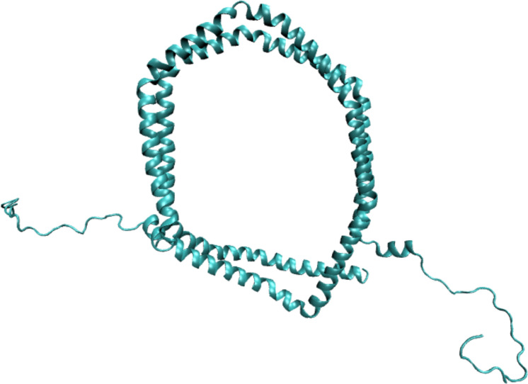
Figure 2—figure supplement 3. Example of a His-tagged nanodisc used for SANS calculations.

Figure 2—figure supplement 3.

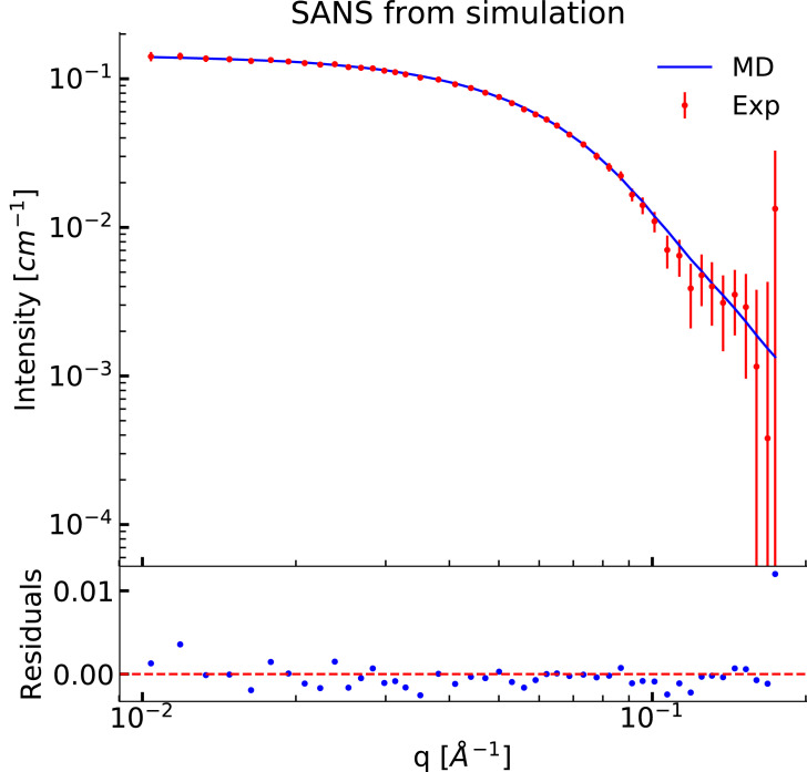
Figure 2—figure supplement 4. Comparing MD simulations with SANS data.

Figure 2—figure supplement 4.

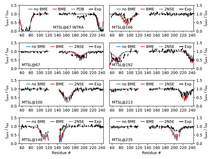
Figure 2—figure supplement 5. Comparing MD simulations with PRE data.

Figure 2—figure supplement 5.

Each panel corresponds a different probe position as indicated by the labels. We show the experimental values (black), those calculated from the structure determined using these and other data (grey) and our MD simulations both before (blue) and after (red) reweighting. For many probe positions and residues, the values calculated from the PDB structure and our simulations are very similar, so that the colored lines appear hidden beneath the grey line.
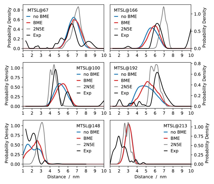
Figure 2—figure supplement 6. Comparing MD simulations with EPR data.

Figure 2—figure supplement 6.

Each panel corresponds a different probe position as indicated by the labels. We show the distance distributions estimated from the experimental measurements (black), and compare to those calculated from the structure determined using these and other data (grey) and our MD simulations both before (blue) and after (red) reweighting.