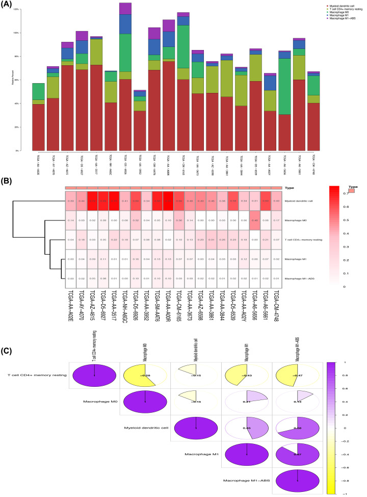
Figure 10. Selection of the 10 groups (left) of samples with the highest risk scores and 10 groups (right) of samples with the lowest risk scores in correlation analysis.
(A) The difference in cell numbers in the 20 samples. (B) Heat map of immune cell expression of the 20 sets of samples. (C) Immune cell correlation matrix, positive correlations displayed in purple, and negative correlations in gold.

