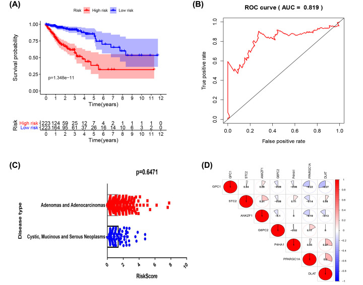
Figure 2. The build of risk scores correlation model.
(A) Analysis of survival prognosis of the constructed glycolysis-related models. Red represents the high-risk group and blue represents the low-risk group. (B) Receiver Operating Characteristic (ROC) curve of the glycolysis-related model. (C) Differences in risk scores for the two types of colon adenocarcinoma. (D) Relationship between the expression of genes of the glycolysis model, red representing a positive correlation, and blue representing a negative correlation. The values represent the degree of correlation.

