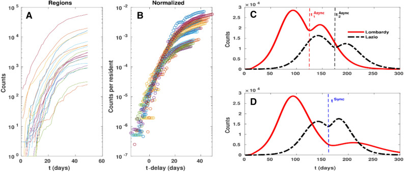
Figure 4.
(A,B) analysis of time delays among the start of epidemic in different Regions (see Table 2). If the dynamics is similar in different Regions, the normalised curves are supposed to be just time shifted versions; (B) shows that indeed Regional curves have a good collapse when shifted by their delays. (C,D) simulated dynamics of an Async(hronous) exit strategy (i.e. each Region lifts the lockdown following its own policy) with respect to a Sync(hronous) exit strategy (i.e. the lockdown lift follows the same policy, but applied to a nation wide scale). In particular, corresponds to lifting the lockdown in all the Region after the peak has fallen by 30%, while corresponds to lifting the lockdown in the Region after the peak of such Region has fallen by 30%.

