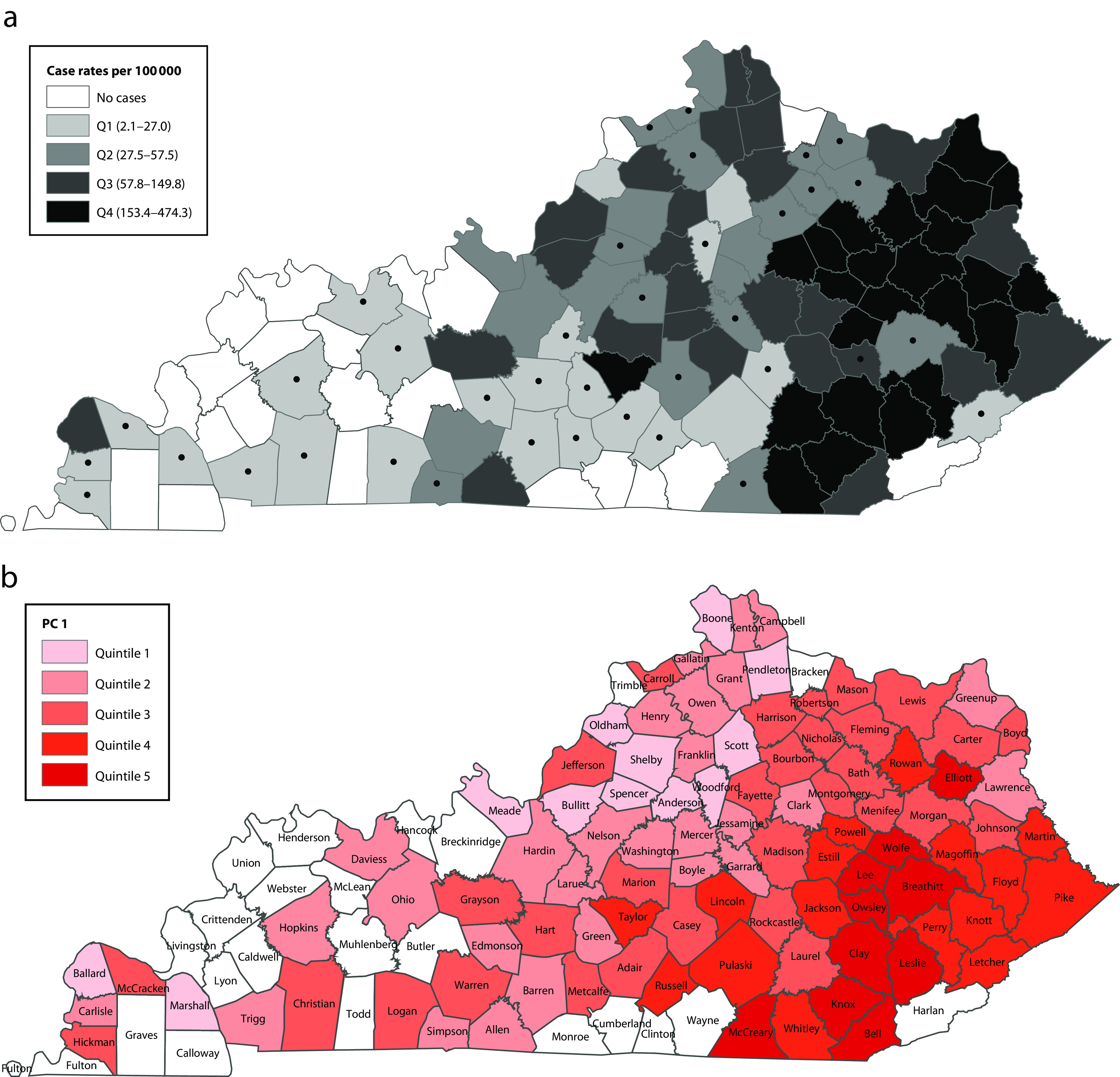
FIGURE 1—

Kentucky Map Showing (a) Incidence of Outbreak-Associated Hepatitis A Cases per 100 000 by County, August 1, 2017, to December 31, 2018, and (b) Spatial Distribution of Quintiles of Principal Component 1 (PC1) Scores in 97 of the 120 Counties
Note. Q = quartile. Dots in part a indicate counties in which case rates were calculated from < 10 cases. PC2 and PC3 score maps are included in Figure B (available as a supplement to the online version of this article at http://www.ajph.org). Counties in white had no reported cases during 2017 to 2018.
