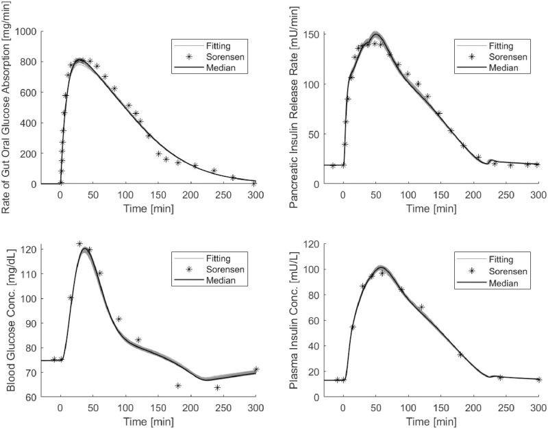
Fig 4. OGTT Sorensen simulations.
Panels show the median and the set of predicted curves obtained by the 200 optimization procedures of STEP 4 starting from optimum of STEP 3: top panel on the left reports “observed” (asterisks) data of the roga function and the SIMO model predicted rate of appearance (continuous line); top panel on the right reports the “observed” (asterisks) and predicted values (continuous line) of the pancreatic insulin release; bottom panels report observed and predicted values of peripheral glucose (on the left) and insulin (on the right) concentrations.

