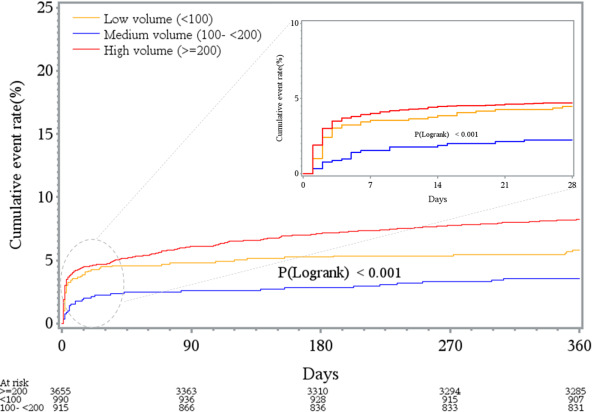
Figure 2. Kaplan‐Meier curves for the entire cohort (n=5560), displaying the unadjusted relationship between hospitals, categorized according to the hospital‐level annual primary percutaneous coronary intervention volume, and all‐cause mortality at 30 days (inset box) and 1 year with a comparison between groups using log‐rank test.