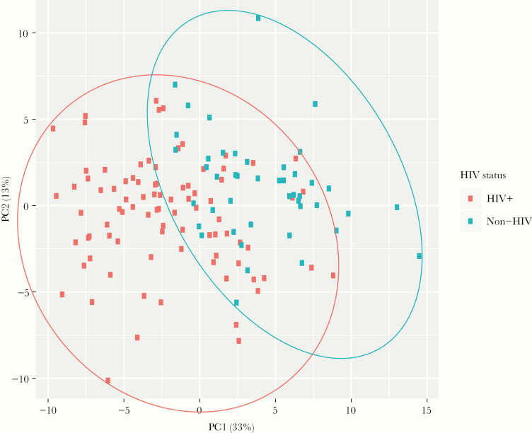
Figure 3.
Principal component analysis. Plot demonstrating a principal component analysis, including the 2 principal components (principal component 1 [PC1] on the x-axis and principal component 2 [PC2] on the y-axis), which explain the most variance across the 78 proteins that were differentially expressed in human immunodeficiency virus (HIV)-infected and non-HIV-infected participants. Principal component 1 explained 33% of the variance, whereas PC2 explained 13% of the variance. Ellipses were drawn to contain all points from each disease category to highlight their different distributions in this space. Participants with HIV are demonstrated using red dots and are contained within a red ellipse; participants without HIV are demonstrated using blue dots and are contained within a blue ellipse. Although there is some overlap in the participants with and without HIV, the majority of participants with HIV are not in overlapping regions of the principal component plot.

