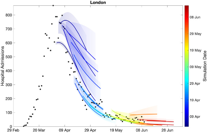
Fig. 3: Sequential comparison of model results and data.
For all daily hospital admissions with COVID-19 in London, we show the raw data (black dots) and a set of short-term predictions generated at different points during the outbreak. Changes to model fit reflect both improvements in model structure as well as increased amounts of data. The intervals represent our confidence in the fitted ODE model, and do not account for either stochastic dynamics nor the observational distribution about the deterministic predictions - which would generate far wider intervals.

