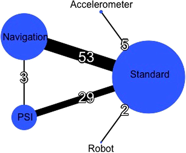
Fig. 2.

In this global network diagram, the nodes (circles) represent different cutting blocks, and their sizes were proportional to the sample size of each respective intervention. The edges (lines) indicate direct comparisons, and their thicknesses were proportional to the number of studies available.
