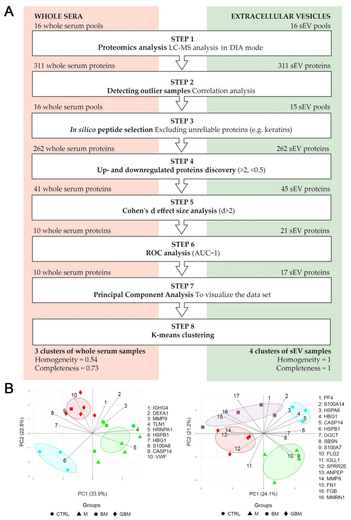
Figure 2.
Statistical analysis of the proteome of whole serum (left) and sEV samples (right). (A) The flowchart shows the steps of selecting the proteins revealed by liquid chromatography and mass spectrometry (LC-MS) (B) The diagrams visualize the results of the principal component analysis (PCA) and k-means clustering. X and Y axes of PCA biplots show principal component 1 (PC1) and principal component 2 (PC2) with explained variances. Arrows represent the coefficients of each protein for PC1 versus the coefficients for PC2, showing the significance of each protein in influencing PCs. Different dots represent the 4 patient groups. Colors indicate the clusters formed by k-means clustering; ellipses indicating the 95% confidence interval were constructed around the barycenters of the clusters.

