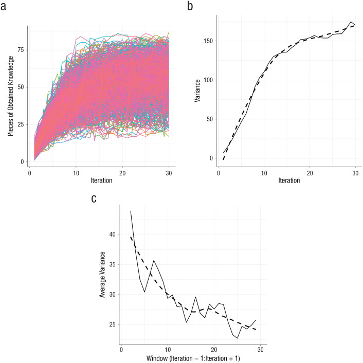
Fig. 7.
The Matthew effect when the Gibbs sampler—used to sample a network from the model—is decelerated. The graph in (a) shows the fan spread that characterizes the Matthew effect. The graph in (b) shows the variance in obtained pieces of knowledge across networks. The graph in (c) shows the average variance in obtained pieces of knowledge across subsequent states of individual networks. The dashed line indicates the smoothed variance; the solid line indicates the actual variance.

