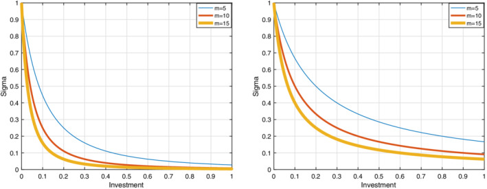
FIGURE 1.

The graphs are related to the relative risk of infection. By increasing the maximum efficiency, the relative risk decreases. The right graph shows the relative risk of infection for each group according to just its investment strategy but the left graph shows the relative risk of infection for each group according to both its investment strategy and others groups investment. The results show that the relative risk of infection in the right graph is less than the relative risk of infection in the left graph [Colour figure can be viewed at wileyonlinelibrary.com]
