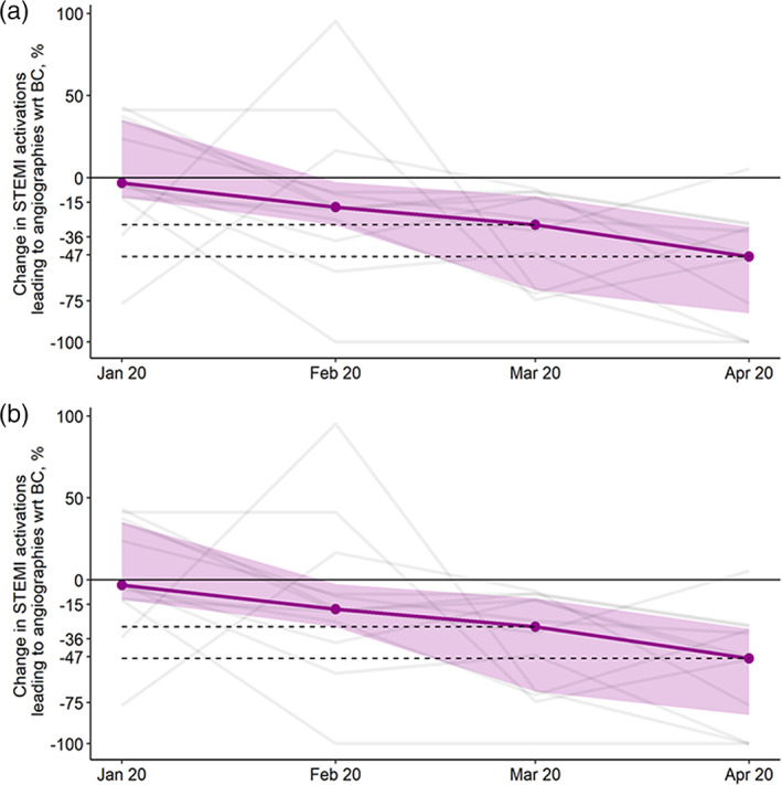
FIGURE 3.

Changes in cardiac catheterization laboratory ST‐elevation myocardial infarction activations leading to angiographies for each program (gray lines) (Panel A) and leading to percutaneous coronary intervention (Panel B) relative to their respective average BC volumes. The purple line represents the overall median. The band represents interquartile ranges. BC, before COVID‐19 [Color figure can be viewed at wileyonlinelibrary.com]
