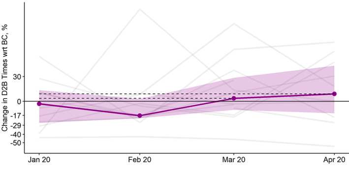
FIGURE 4.

Changes in median door to balloon times for each program (gray lines) relative to their respective average BC volumes. The purple line represents the overall median. The band represents interquartile ranges. BC, before COVID‐19 [Color figure can be viewed at wileyonlinelibrary.com]
