
Figure 13.
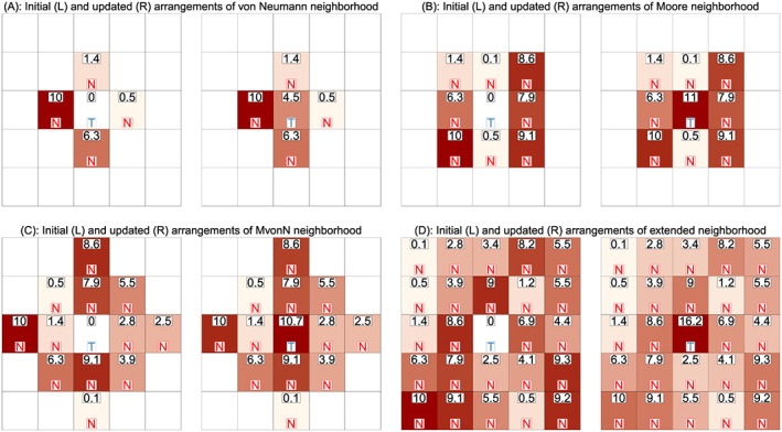
One‐step forward evolution of the infection prevalence (× 103) for the central cell in the simulation study. Four different neighbourhood types are illustrated, including (A) von Neumann neighbourhood, (B) Moore neighbourhood, (C) MvonN neighbourhood and (D) extended neighbourhood. The numeric value indicates the proportion of infectious people in each cell. The letter indicates target (T) or neighbour (N) cells, respectively. [Colour figure can be viewed at wileyonlinelibrary.com]