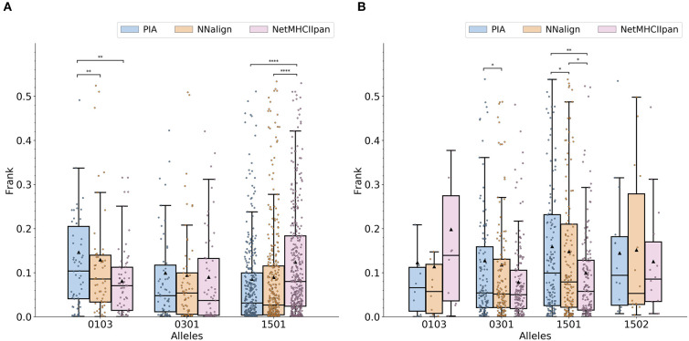
Figure 2.
Comparisons of prediction quality on (A) MS ligand and (B) epitope data. The center line inside the box indicates the median Frank and the triangle shows the mean Frank. The data points available in IEDB are represented using a jitter plot. The colored box covers the interquartile range. The whiskers represent 1.5-fold of the interquartile range. Pairwise p-values were calculated using a Wilcoxon signed-rank test (applying Pratt's zero method). *0.01 < p ≤ 0.05, **0.001 < p ≤ 0.01, ***0.0001 < p ≤ 0.001, and ****p ≤ 0.0001.

