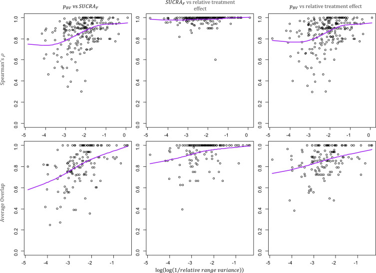
Figure 3.
Scatter plots of the relative range of variance in a network and the pairwise agreement between hierarchies from different ranking metrics. The relative range of variance, calculated as , indicates how much the information differs between interventions in the same networks. Networks with larger differences in variance are on the left-hand side of the plots. Spearman (top row) and Average Overlap (bottom row) values for the pairwise agreement between and SUCRAF (first column), SUCRAF and relative treatment effect (second column), and relative treatment effect (third column). Purple line: cubic smoothing spline with five degrees of freedom. pBV, probability of producing the best value; SUCRAF, surface under the cumulative ranking curve (calculated in frequentist setting).

