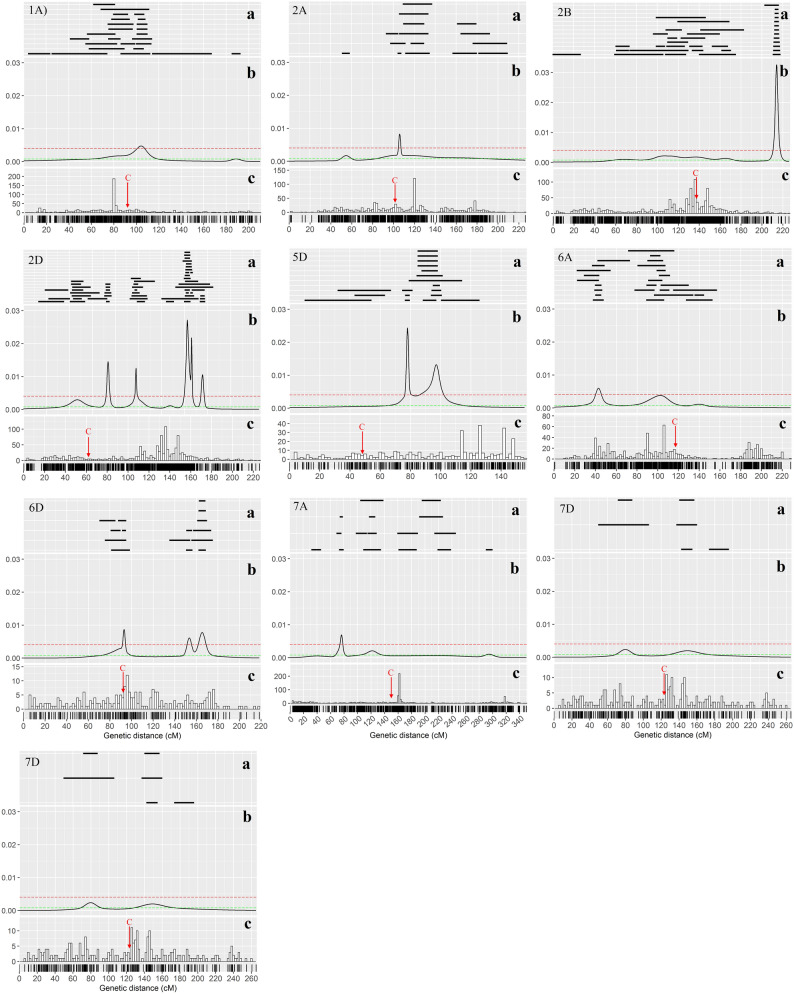
Figure 6.
Diagrams show the different features that were drawn using the ggplot2 package in R environment. (a) Distribution of initial QTLs on each chromosome of wheat (black lines). (b). Probability density computed as ‘QTL-overview index’25. (c) Distribution and density of marker on the consensus genetic map. The red dashed line with the value of 0.00106 indicates the high-value threshold. The red color arrow indicates the centromeric region of the chromosome.

