
Extended Data Fig. 5. Overview of cSLE and aSLE combined (caSLE) dataset.
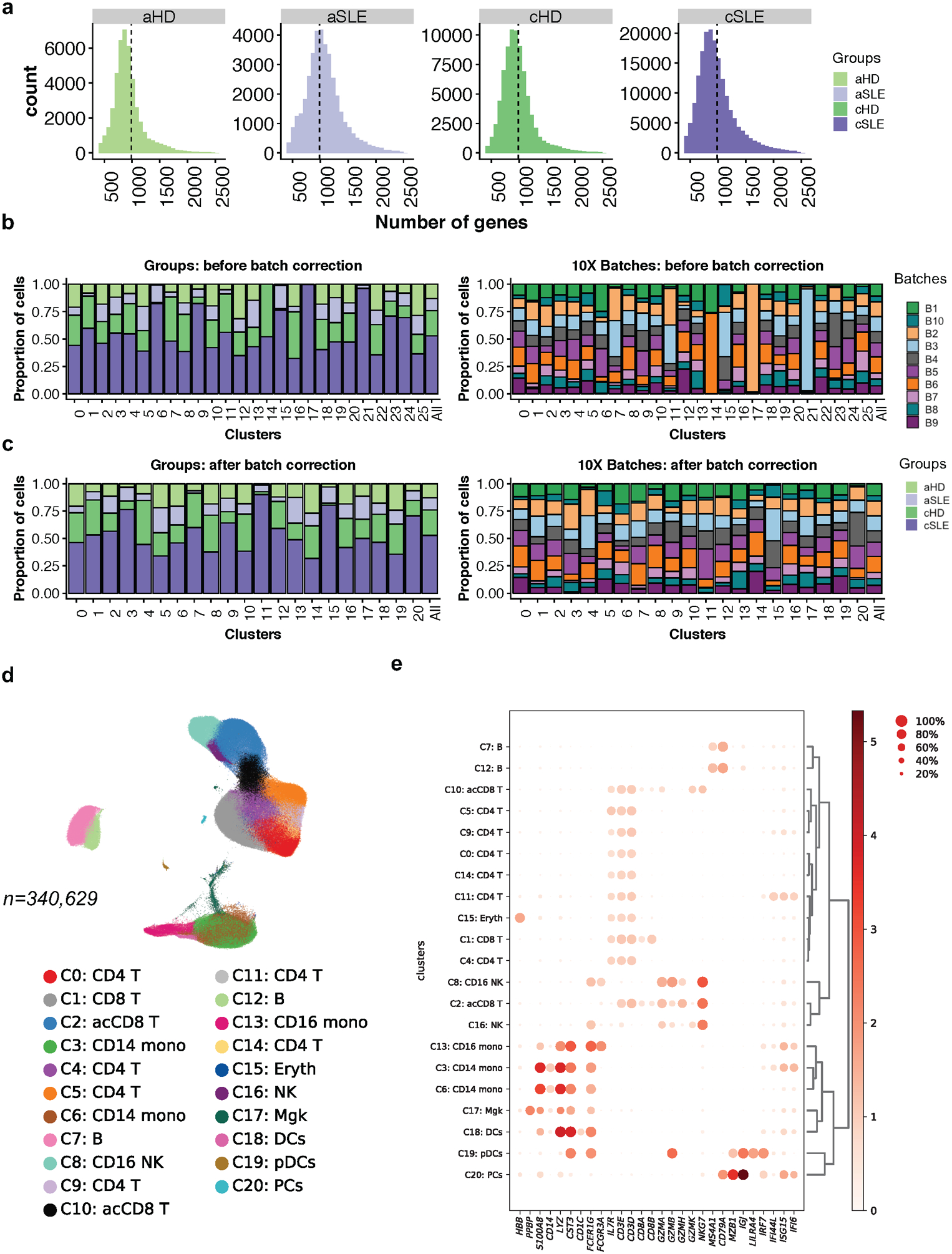
(a). Number of detected genes across cells in cSLE (n=33), aSLE (n=8), cHD (n=11) and aHD (n=6). Vertical lines represent the mean.
(b,c). Bar plot highlighting the cell abundances across cluster (n=26) for cSLE, aSLE, cHD and aHD groups (left panel) and 10X run batches (right panel) before (b) and after (c) BBKNN batch effect correction. Each color represents groups (left) and batch (right).
(d). UMAP plot representing the 21 clusters across 340,629 PBMCs from cSLE (n=33), aSLE (n=8), cHD (n=11) and aHD (n=6). Each color represents a distinct cluster.
(e). Cluster annotation. Dot plot representing expression values of selected genes (x-axis) across each cluster (y-axis). Dot size represents the percentage of cells expressing the marker of interest. Color intensity indicates the mean expression within expressing cells.