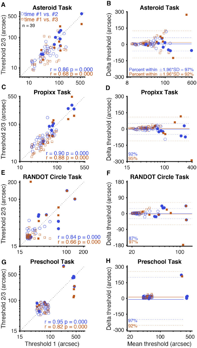
Figure 2.

Test–retest reliability. (A, C, E, G) Graphs on the left side of the figure represent threshold values determined by each test for each subject, plotted with a line representing perfect 1:1 correlation. (B, D, F, H) Bland–Altman plots for each test on the right side of the figure show mean delta (solid line) and 95% limits of agreement, or ±1.96 × SD (dotted lines). Blue circles and lines represent each subject's second attempt at the test plotted against their first attempt. Orange squares and lines represent each subject's third attempt at the test plotted against their first attempt (approximately 14 days later). The two subjects who did not return for follow-up visits are included but do not contribute to the orange squares. Randot Circles and Randot Preschool points are jittered, but all statistics are computed from the raw data (log10 transformed). Filled shapes represent stereo-abnormal subjects; non-filled shapes represent stereo-normal subjects.
