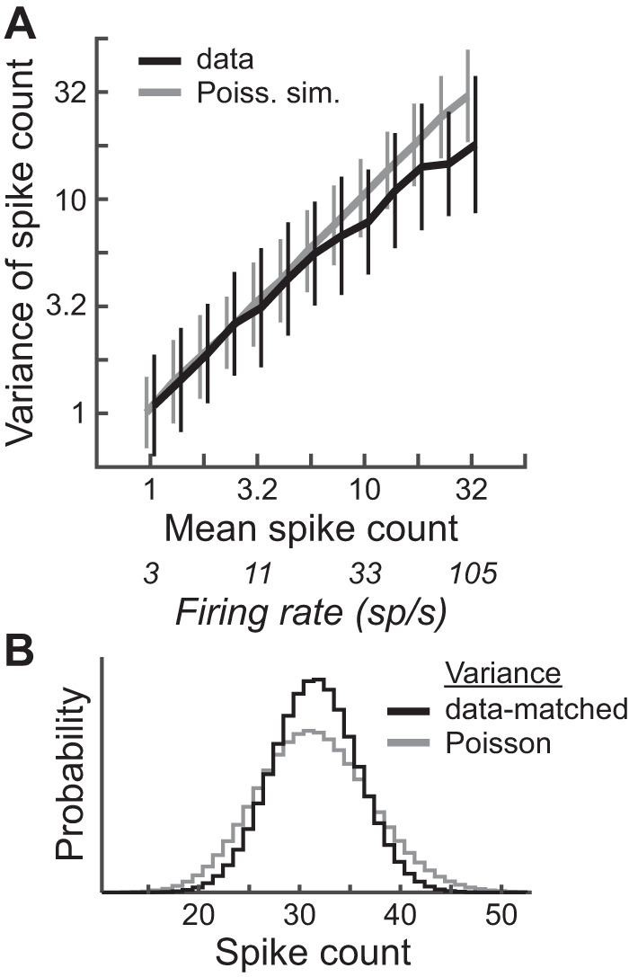
Fig. 3.

Comparison of spike count distributions to Poisson distributions. A: log sample variance (mean ± SD) vs. log sample mean for all spike count sample sets in the data except those used to measure frequency-level response areas, binned within equally log-spaced bins of mean spike count (black curve; N is between 354 and 1,222 within each bin) and same plot for simulated spike count data drawn randomly from Poisson distributions with means and number of trials matched to those in the experimental sample sets (gray curve). Unbiased estimates of log sample variance were computed by adding log10e/(m − 1) to the log10 sample variance, where m is the number of trials (Gershon et al. 1998). Curves are shifted horizontally for visibility. B: theoretical spike count distributions, each with means of 32, the highest mean count in the data (rate = 105 sp/s): Poisson distribution (gray curve) and discretized, normal distribution with variance set to the average of that of experimental data at a mean of 32 (black curve).
