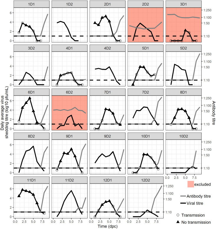
Fig 3. Individual donor and recipient pigs’ infection kinetics.
Each box represents a donor pig. The viral kinetics is represented by a black line. Black triangles represents the average daily shed virus titres on days with transmission event and open circles represent the average daily shed virus titres on day without transmission events. The time since separation of seeder and donor is shown on the x axis. Antibody titers are represented by the grey line. The red filled boxes represent the pigs with baseline antibodies that were excluded from the analysis.

