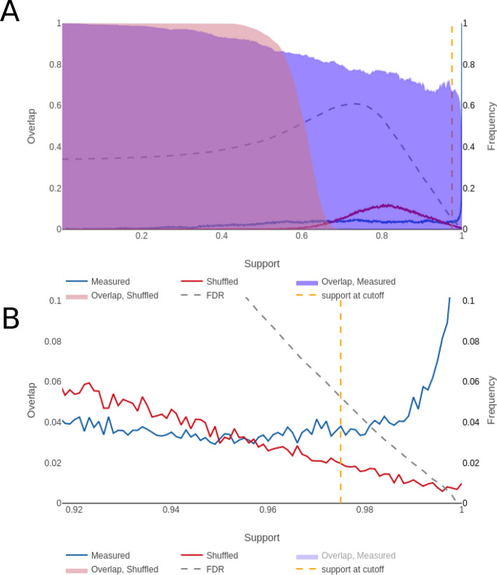
Figure 5.
NestBoot output for the overall best performing GRN. (A) Shows the entire bootstrap support range from 0 to 1, as well as overlap between all bootstrap GRNs for measured (blue) and shuffled (red) data. The FDR is estimated via a null background model based on networks inferred from shuffled data. This is done to restrict inclusion of false links by setting FDR e.g. to 5%. The dashed orange line represents the cutoff where this is reached, here at 97.5% bootstrap support. The dashed grey line shows how the FDR behaves as a function of the bootstrap support. (B) Shows the fine detail of the curves in the support levels between 0.9 and 1. These visualizations were made by the provided shiny app.

