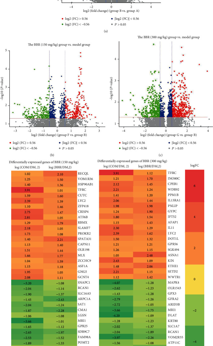
Figure 3.

Volcano plot of gene expression profile data between the (a) model and normal samples, (b) BBR (150 mg/kg) and model groups, and (c) BBR (300 mg/kg) and model groups. Heat map of DEGs in (d) BBR (150 mg/kg) and (e) BBR (300 mg/kg). Green represents a lower fold change value; red represents a higher fold change value. Each column represents one dataset, and each row represents one gene. The number in each rectangle represents fold change in the BBR compared with the control samples or the control samples compared with the model samples. The gradual color that ranged from red to green represents the changing process from upregulation to downregulation.
