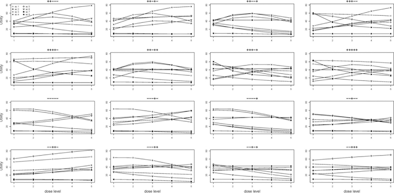
Figure 4:
Utility of the five doses for 16 biomarker patterns under the eight scenarios. Each graph shows the utility for one biomarker pattern. The symbols “+” and “−” above each graph indicate the status for the 5 biomarkers. The eight curves within each sub-group represent the utilities for the eight scenarios.

