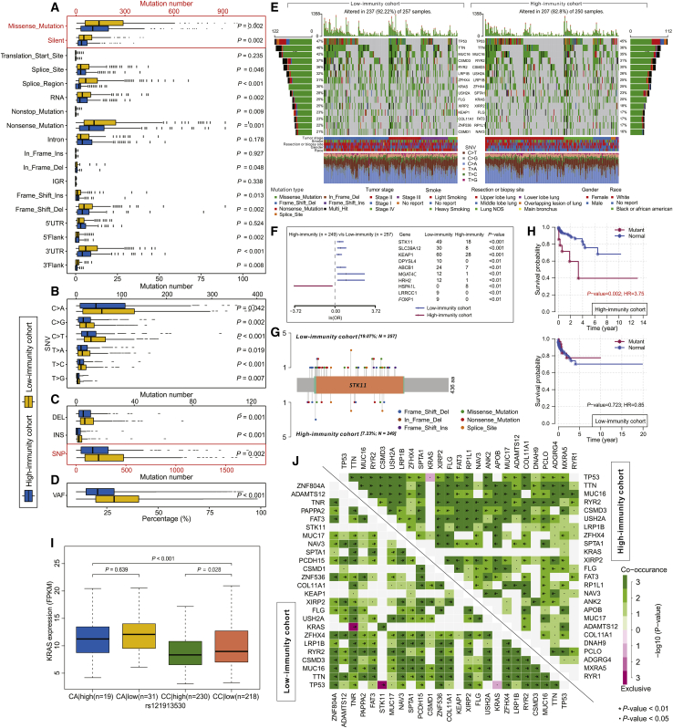
Figure 3.
Landscape of Somatic Mutation in High-Immunity and Low-Immunity Cohorts
(A–D) Boxplots showing the comparisons of mutation frequencies of (A) every mutation type classified by effects, (B) SNV, (C) INDEL and SNP, and (D) the percentage of VAF between high-immunity and low-immunity cohorts. (E) Waterfall plot shows the mutation distribution of the top 15 most frequently mutated genes. The central panel shows the types of mutations in each LUAD sample. The upper panel shows the mutation frequency of each LUAD sample. The bar plots on the left and right side show the frequency and mutation type of genes mutated in the low-immunity and high-immunity cohort, respectively. The lower part shows the clinical features (tumor stage, smoke, resection or biopsy site, sex, and race) and SNV types of each sample. The bottom panel is the legend for mutation types and clinical features. (F) Forest plot displays the top 10 most significantly differentially mutated genes between two cohorts. (G) The lollipop plot illustrates the differential distribution of variants for STK11. (H) Kaplan-Meier curves show the independent relevance between overall survival time and STK11 mutation in high-immunity and low-immunity cohorts. (I) The boxplot shows the expression changes of KRAS with or without SNP rs121913530 between the high-immunity and low-immunity cohorts. (J) The heatmap illustrates the mutually co-occurring and exclusive mutations of the top 25 frequently mutated genes. The color and symbol in each cell represent the statistical significance of the exclusivity or co-occurrence for each pair of genes.

