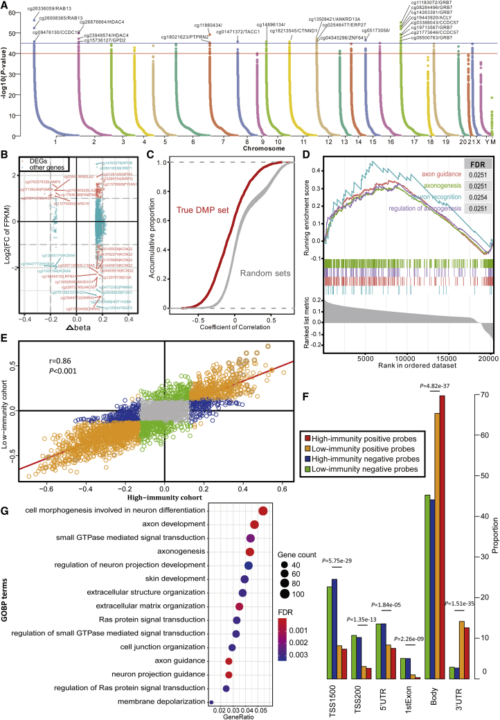
Figure 4.
DNA Methylation Pattern in TIME
(A) Manhattan plot of the genome-wide DNA differential methylation in high-immunity and low-immunity cohorts. (B) The relationships between expression change and DNA methylation level. The nodes in red represent the DEGs with log2FC of FPKM >2 and Δbeta >0.15. (C) The distributions of Pearson correlation coefficients between gene expression level and beta value in true DMP set and 100 random sets. (D) Gene set enrichment analysis (GSEA) shows the significant enrichment in four neuron-associated biological processes. Genes are ranked by Δbeta. (E) Scatterplot showing the correlations of methylation-expression correlation coefficients between high-immunity and low-immunity cohorts. (F) The histogram shows the regional difference between the positive and negative probes. (G) Bubble plot showing the results of GO biological process (GOBP) enrichment analyses on DMP-associated genes. The x axis (fold enrichment) represents the ratio of two proportions, of which one is the proportion of input genes involved in the given GO term and another is the proportion of genes in the given GO term involved in the background.

