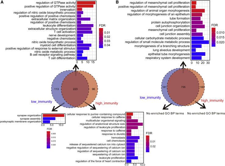
Figure 5.
Functional Enrichment Analyses of the Positively and Negatively Correlated Genes
(A) Positively correlated genes. (B) Negatively correlated genes. The results of the consistently correlated genes between the high-immunity and low-immunity cohorts are shown at the top of the Venn diagram, and the results of the uniquely correlated genes are shown on the bottom. The x axis reflects the overlapped gene numbers between each GO term and query gene set. The color of the bars represents the gradient of adjusted p values (FDR correction).

