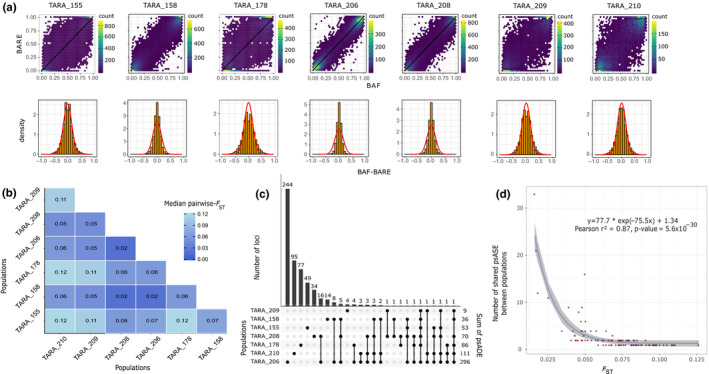
Figure 3.

Population‐scale allelic differential expression and its link with genomic differentiation. a, Each column corresponds to a population. Upper panel represents the relation between BAF and BARE, each hexagone corresponds to an area containing the number of variants indicated by the color scale. Black lines are the linear regression curves. Lower panel represents the distribution of BAF‐BARE. The red lines correspond to the Gaussian distribution estimated from the data. b, Pairwise F ST matrix. The median (mean) of each pairwise‐F ST distribution computed on allele frequencies is indicated c, Upset plot of psADE detection in the seven populations. Each bar of the upper plot corresponds to the number of variants under psADE in the combination of population(s) indicated by black dots in the lower plot. d, Genomic differentiation and shared psADE. Each dot is a combination of population as presented in the lower panel of the upset plot. The blue line represents the nonlinear regression curve estimated from the data and 95% confidence interval in gray
