Figure 5.
Metabolomic Profiling of Fecal Samples from the Bif/Lacto and Control Groups via 1H NMR Spectroscopy
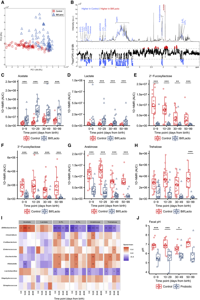
(A) Principal-component analysis (PCA) scores plot comparing the fecal metabolic profiles of the Bif/Lacto and control groups at all time points.
(B) Discriminatory metabolites that contribute to the covariate-adjusted projection to latent structures-discriminant analysis (CA-PLS-DA) model comparing the fecal metabolic profiles of the Bif/Lacto and control infants adjusted for sampling age. Top panel: average 1H NMR spectrum from all samples indicating metabolites that are excreted in greater amounts by the Bif/Lacto infants (red) and those excreted in greater amounts by the control infants (blue). Bottom panel: Manhattan plot showing p values calculated for each variable in the multivariate model, corrected for multiple testing using the false discovery rate (allowing 5% false discoveries). Horizontal lines indicate cutoff values for the false discovery rate on the log10 scale. Blue points indicate metabolites significantly higher in the control feces and red points indicate those metabolites significantly higher in the Bif/Lacto feces.
(C) Relative acetate concentration.
(D) Relative lactate concentration.
(E) Relative 2′-fucosyllactose (2-FL) concentration.
(F) Relative 3′-fucosyllactose (3-FL) concentration.
(G) Relative arabinose concentration.
(H) Relative trehalose concentration.
(I) Spearman correlation heatmap displaying main fecal metabolites (rows) versus the most abundant bacterial groups (columns). Red denotes positive correlation and blue denotes for negative correlation.
For metabolite data (N = 0–9 days (control: n = 17, Bif/Lacto: n = 18); 10–29 days (control: n = 23, Bif/Lacto: n = 21); 30–49 days (control: n = 22, Bif/Lacto: n = 23); 50–99 days (control: n = 13, Bif/Lacto: n = 11)).
(J) Group fecal sample pH (N = 0–9 days (control: n = 9, Bif/Lacto: n = 6); 10–29 days (control: n = 10, Bif/Lacto: n = 7); 30–49 days (control: n = 11, Bif/Lacto: n = 10); 50–99 days (control: n = 5, Bif/Lacto: n = 7)).
Boxplots show group median and interquartile range, diamonds indicate the group mean, and individual points highlight individual infant samples. Asterisks represent p values: ∗p < 0.05, ∗∗p < 0.01, ∗∗∗p < 0.001. See also Figures S6 and S7 and Table S8.

