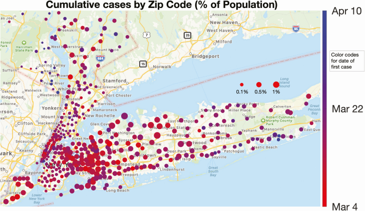
Figure 6.
Spatial distribution of the local percentage of population infected and its progress with time. Each circle represents a New York State zip code area, and its size is proportional to the number of positive cases normalized by the population in the zip code. The color of each dot represents the first day that cases were detected (the hues range from red to blue, corresponding to the time period 4 March–10 April). The first cases appeared early in most zip codes, denoted by their predominantly red color. A dynamic representation of the growth leading to this map is available in the Supplementary Video.

