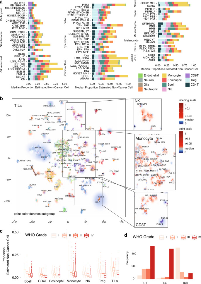
Fig. 2. Deconvolution analysis of panCNS tumor immune infiltration.
a Barplots of the estimated median infiltration of specific cell types as a proportion of all non-cancer cell types (range scaled from 0 to 1) in 3763 CNS tumor samples from the Capper et al.31 panCNS tumor cohort. Data shown by tumor type/subtype highlighting the range and variation of immune cell infiltration in different CNS tumor types. b t-SNE plot representing the methylation profiles of the panCNS cohort. The colors of dots and a text label marking tumor type/subtype in the central panel map to the tumor type are as per Capper et al.31 (for full key see Supplementary Table 4). Background shading represents the 2D spatial density estimation of the amount of tumor-infiltrating lymphocytes (TILs); red shading equals relatively greater than average infiltration and blue shading equals less than average. Exploded side panels represent enlarged areas of interest wherein both dot color and background shading represent the relative amount of the particular immune cell infiltration denoted. Red color denotes relatively greater than average infiltration and blue color denotes less than average. c Boxplot showing a negative association between proportion of estimated cell types and WHO grade; n = 2315 biologically independent samples. Box represents interquartile range, center line represents median, and whiskers represent range of minima and maxima excluding outliers that are represented as points. d Barchart showing differences in frequency of patients of different WHO grade by immune cluster; n = 2315 biologically independent samples.

