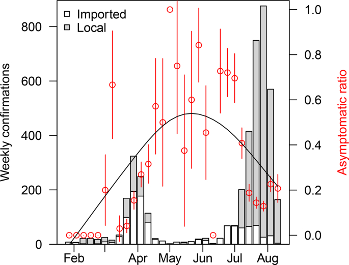
Fig. 1.
The time serial distribution of weekly confirmation and asymptomatic ratio. The proportion of asymptomatic COVID-19 cases were plotted in red dots with 95% confidence interval indicated by the vertical red lines and the corresponding serial trend was simulated in the black smooth curve. The classification was shown in the bars with the grey representing the local cases and the white representing imported cases. (For interpretation of the references to colour in this figure legend, the reader is referred to the web version of this article.)

