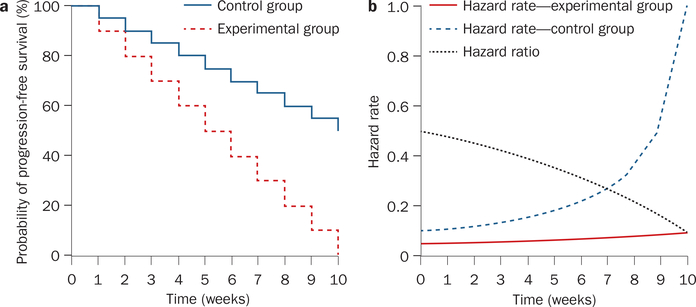
Figure 4 |.
Graphical presentation of hypothetical clinical trial data (Table 3) demonstrates how the hazard rate is calculated and how this rate can be used to calculate the hazard ratio.
a | Kaplan–Meier plot for the two arms of the hypothetical study (control and experimental).
b | The hazard rate can vary over time and this variation can disproportionately affect one arm of the trial at different time points.

