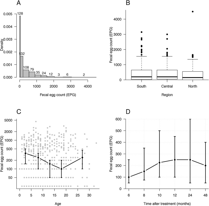
Fig. 2.
A) A density histogram reflecting the skewed distribution of eggs per g of faeces (EPG) where the width of the bar represent the size of each EPG-cluster. EPG were clustered as follow: 0; 50–150; 200–500; 550–850; 900–1200; 1250–1550; 1600–2000; 2050–2500; 2550–3000; 3050-4500. Figures above each bar indicate number of horse in each EPG-cluster. Density of the y-axis illustrates the number of horses divided by the length of each corresponding interval. For example, there were 529 horses in total of which 128, corresponding to 24%, had EPG < 50. The density of this class is hence 0.24/50 = 0.0048. B) A boxplot of EPG in the three different regions in Sweden. The bold line indicates median, the fine lines are the quartiles and dots represents outliers in the population and the horizontal line in the boxplot is the so called ‘upper whisker’. There was no statistical differences in EPG levels between the regions. C) Median EPG levels (black dots) plotted against the age of the horses. The horses are clustered in age groups of 0–5; 6–10; 11–15; 16–20 and ≥ 21 years. The dots represent the median of each age group and the vertical lines indicate the 95% confidence intervals. All data are included as grey dots. The Y-axis is log transformed. D) Median EPG in relation to last treatment. The vertical lines indicate the 95% confidence intervals.

