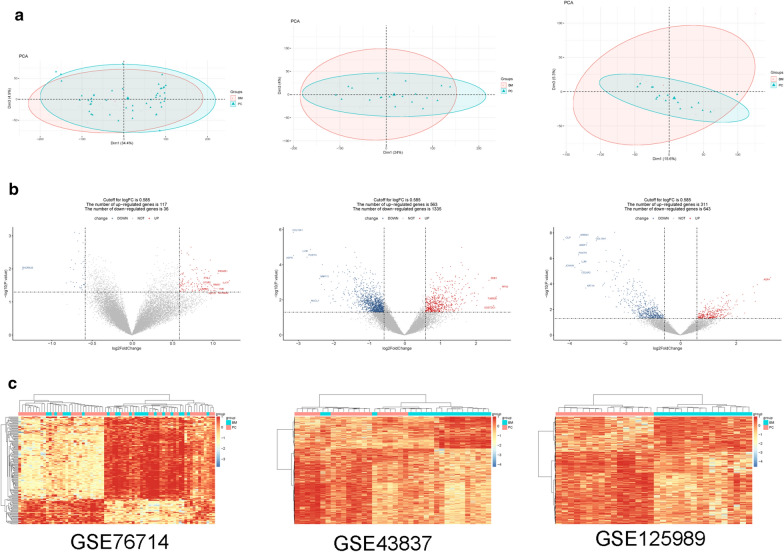
Fig. 2.
a Clustergrams of principal component analysis for three datasets. b The volcano plots for differentially expressed genes (DEGs) in three datasets. The red square represents upregulated DEGs, the blue circle represents downregulated DEGs, and the black triangle represents non-DEGs. The transverse dashed line is the p value, and the longitudinal dashed line is the fold change. The genes with the top tenfold changes are shown in the figure. c The heatmap of DEGs in three datasets. Red represents high expression and blue represents low expression

