
Figure 1.
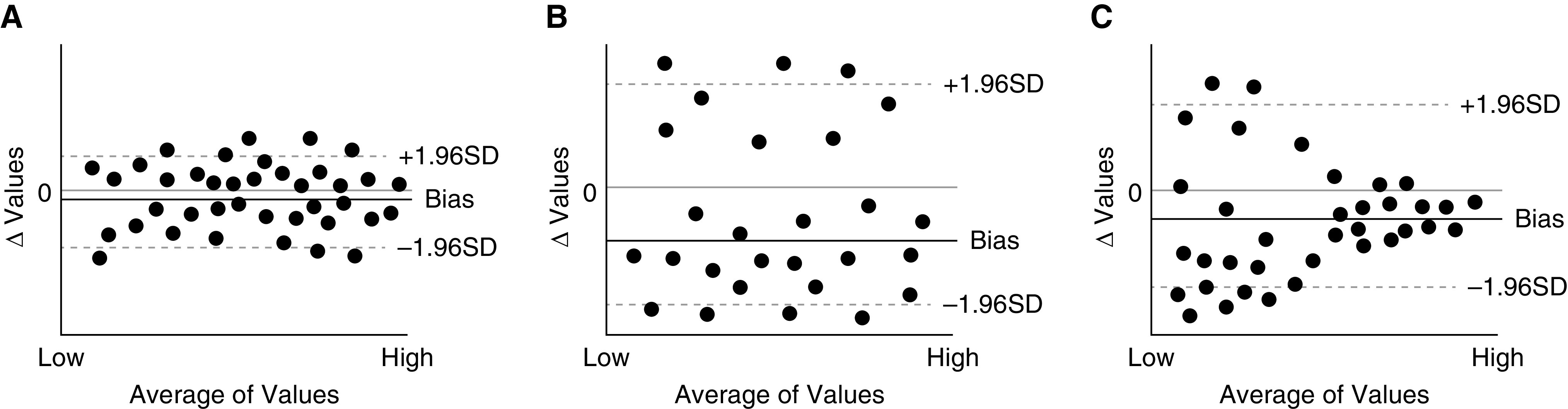
Examples of data plots from Bland-Altman analysis. (A) An example on an ideal monitoring device. The bias is close to zero and the levels of agreement are narrow. (B) An example of monitoring device with poor performance. Compared with A, the bias is further away from zero and the limits of agreement are wider. (C) Another example of a monitoring device with poor performance. The differences between the monitor and the gold standard are markedly larger at the low end of the measured values than at the high end. Increased spread in values at the low end of the spectrum of oxygen saturation is a known feature of pulse oximeters. SD = standard deviation.