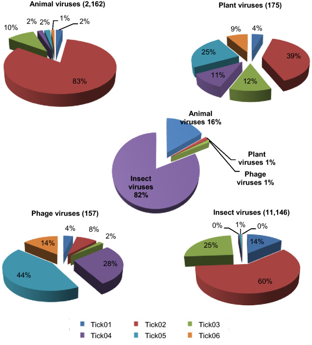
Fig. 2.
The composition and distribution of viruses detected in each tick pool. The pie chart in the center showed the approximate percentages of the four virus groups detected in all six pools. The four circumjacent pie charts show the approximate percentages of the indicated types of virus sequences from different pools. The data for each pool are represented with different colors.

