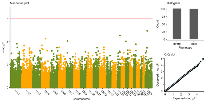
Fig. 1. Manhattan plot.
Genome-wide single variant association study based on the dataset of all single variants. X axis indicates the variant location at hg19, chromosomes separated by different colors; y axis indicates the − log10(P value) from Fisher’s exact test. The red line indicates the genome-wide significance threshold [y = − log10(0.05/58,336)]. Histogram indicates the number of case group and control group. Q–Q plot indicates the observed association P values and the expected P values followed the uniform distribution.

