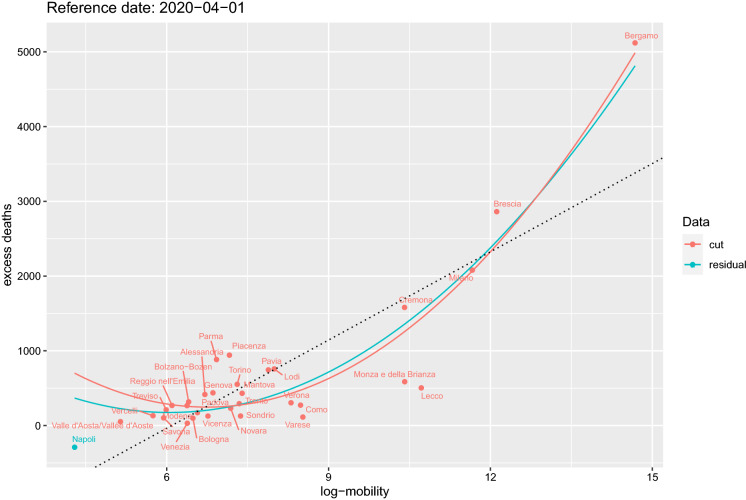
Fig. 10.
Data for log-mobility on 2 March 2020 and cumulative excess deaths on 1 April 2020. Red represents the selected subset of positive excess deaths and mobility. The other points are the residual data. Red and light blue together represent the whole data. The two curves correspond to the fitted model (2) for both data sets. The for this fitted model is 0.91. The straight line represent simple linear regression of the two variables in the plot. The black vertical lines are on the dates of local lockdowns on 21 and 27 February 2020 and country-wise lockdown on 9 March 2020. The green lines are the same as the black lines, but shifted by 14 days. (Color figure online)

