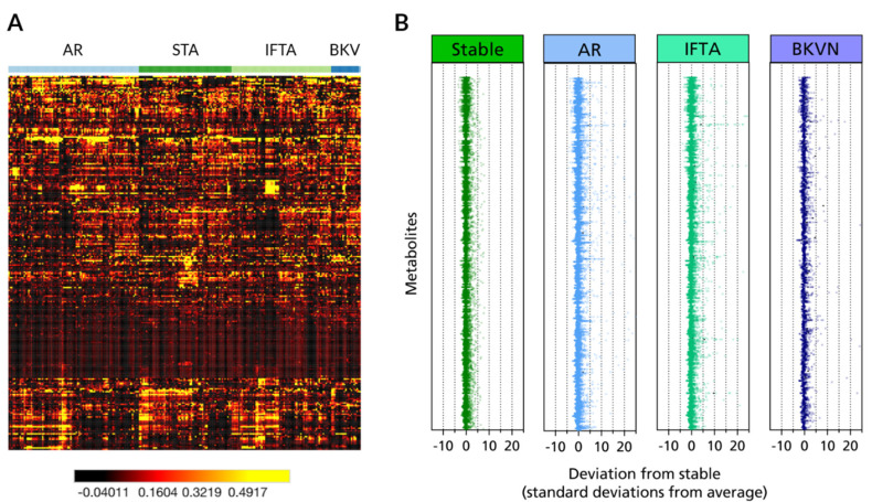
Figure 2.
Metabolomic profiling of renal transplant outcomes. (A) Heat map representation of unsupervised hierarchical clustering by metabolite (rows) grouped by transplant phenotype (columns). Shades of black to red to orange to yellow represent continuous increases of a metabolite relative to the median metabolite levels (see color scale). (B) z-score plots for the data in a normalized to the mean of the stable phenotype urine samples (truncated at 25 s.d. for clarity).

