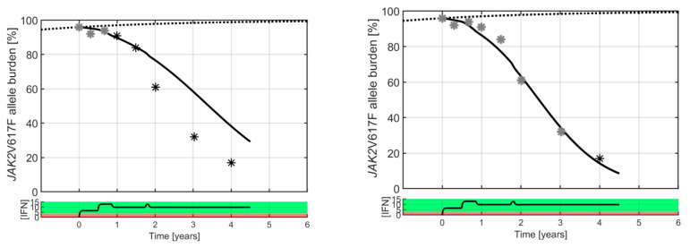
Figure 3.
A typical good responder is shown with a high baseline value (50% JAK2V617F allele burden). Black and grey stars are clinical measurements, whereas the full curves are model predictions. The dotted curve is a sigmoidal increasing “population” master curve corresponding to unperturbed disease growth. Grey data points are used to calibrate the Cancitis model for personalized prediction, and the black data points are the clinical measurements used for validation. Generally, three data points for calibrating the model provide good predictions, but increasing the number of data points increases the accuracy of the predictions. A curve generated by a pharmacokinetic model displays the daily average IFN dose in µg in black in the bottom panel (see Supplementary Material A). The red dose–response region indicates the dosing value of poor individual response, and the green dose–response region indicates the dosing value of good individual response, hence the separation between the two represents the effect threshold for the particular patient shown. A catalogue of all model predictions based on the various numbers of visits to the clinic for each patient can be found in Supplementary Material B.

