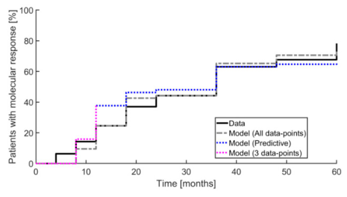
Figure 4.
An inverse Kaplan–Meier plot is shown illustrating the fraction of patients obtaining a partial molecular response (50% reduction relative to baseline) during the 60 months of measurement. The full black curve shows data and the grey dashed curve shows model prediction using all data points for calibration. The dotted blue curve shows the model prediction, where for each step only the preceding data points were used. The dashed purple curve shows the predictions of the first three data points using these for calibration.

