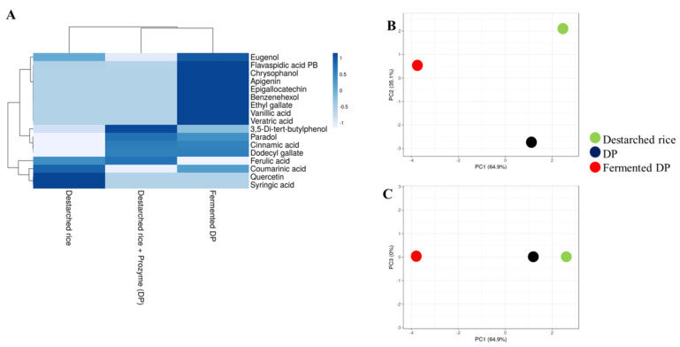
Figure 4.
Relative levels of phenolic compounds in destarched rice, Prozyme treated destarched (DP), and fermented DP. (A) Heat map shows the different levels of phenolic compounds present in the three samples. The color range from blue to white represents higher to lower levels of phenolic compounds. (B,C) are principal component analysis (PCA) plots. (B) consists of PC1 and PC2, while (C) consists of PC1 and PC3. Red circles represent fermented DP, black represents Prozyme treated destarched rice (DP), and green represents destarched rice samples.

