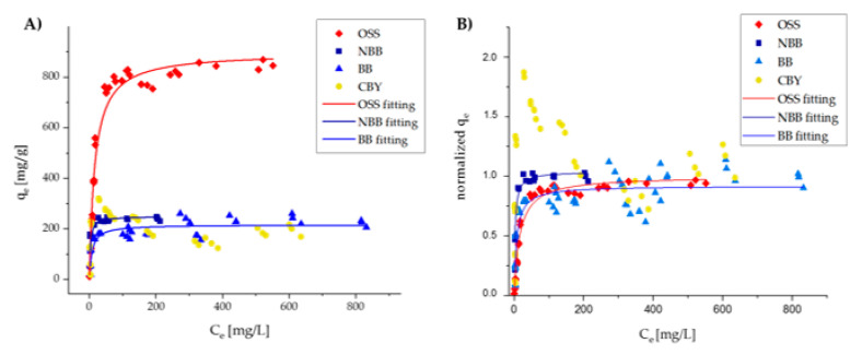
Figure 5.
Graph showing the data collected for the calculation of isotherm curves. The x-axis shows the concentration at equilibrium (Ce) expressed in mg/L, while the y-axis shows the capacity at equilibrium (qe) expressed in mg/g and not normalized (A) and normalized for the maximum capacity (Qmax) (B).

