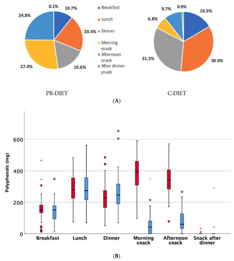
Figure 3.
Total phenolic contribution from different meals during the polyphenol (PR)-diet and the control (C)-diet expressed as percentage (Panel A), or expressed as amount in mg during the PR-diet (in red) and the C-diet (in blue) as estimated through PE/USDA databases and other published data (Panel B). Dots represent mild outliers that are more extreme than Q1 − 1.5 * IQR or Q3 + 1.5 * IQR but are not extreme data. Asterisks are extreme data that are more extreme than Q1 − 3 * IQR or Q3 + 3 * IQR (where Q1=quartile 1; Q3=quartile 3; IQR=interquartile range).

