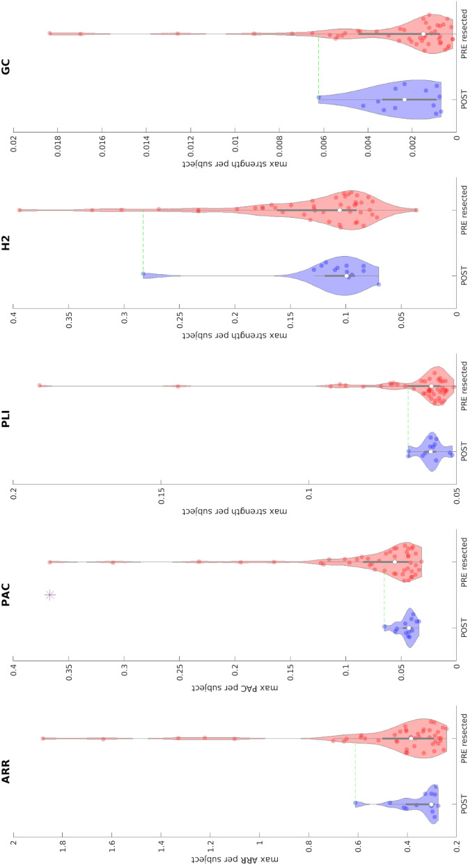
Figure 3.
Comparison between maximum biomarker values between pre-resection resected channels (red) in improved patients and post-resection channels in cured patients (blue) using a bipolar montage. Each dot represents the maximum value of the biomarker across all channels of each patient. The presence of an asterisk indicates that the two distributions are significantly different (p < 0.01 one-sided Kolmogorov–Smirnov test). Inside each violin-plot a boxplot is depicted in gray with the median value highlighted with a white dot. For each biomarker, the green line represents the threshold used to define the normal tissue (biomarker reference) using post-resection cured patients. ARR Auto-regressive residual modulation, PAC phase amplitude coupling, PLI phase lag index, H2 non linear correlation coefficient, GC granger causality.

