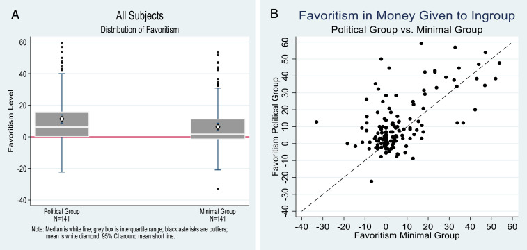
Fig. 2.
Favoritism levels for all subjects (n = 141). (A) Favoritism is scaled on the y axis, with possible maximums of ±69.23. Shown are box and whisker plots of the medians, interquartile ranges, and outliers. Superimposed are white diamonds for the means and the related 95% CIs. The political group treatment is on the left, and minimal group treatment is on the right. (B) Individual favoritism levels for each subject in the minimal group treatment (x axis) and the political group treatment (y axis). The dashed line is the 45° line.

