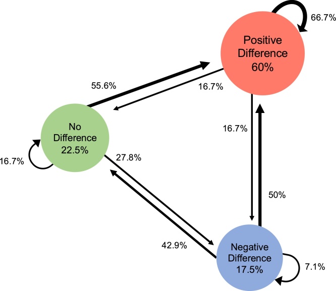
Fig. 7.
Markov model depicting the transition trajectories observed across the two visits for the Nc amplitude denoting face-categorization. Circles report the percentage of infants that at Visit1 show either no difference between face-house amplitudes (green), a negative difference (blue), or a positive difference (red). The circular arrows indicate the percentage of infants that at Visit2 remain in a category, while straight arrows indicate the percentage of infants that moved from one category at Visit1 to another at Visit2.

